Abstract art is wild. It’s expressive. It breaks all rules—but color still matters. Choosing the right color combos can make or break your canvas. So, what colors go with what when painting abstract art? This post dives deep. It’s practical. It’s powerful. It’s loaded with charts, examples, and ideas to skyrocket your creativity with colorful abstract art.
Why Color Matters in Abstract Art?
-
- Color triggers emotion.
- Color guides the viewer’s eye.
- It creates contrast, harmony, or chaos.
- It helps deliver the mood without needing shapes or figures.
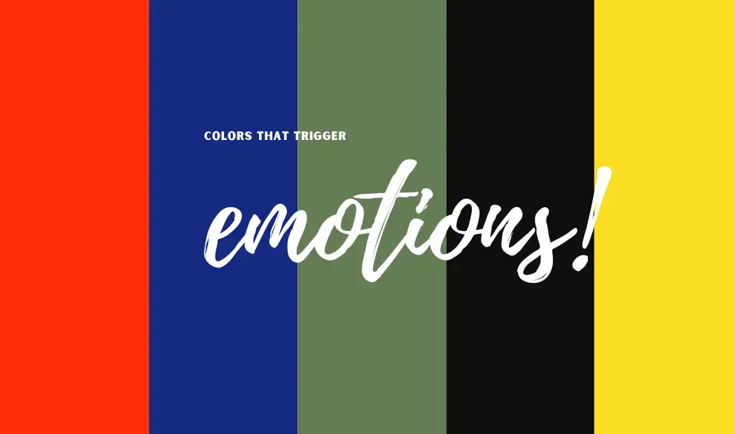
→ Emotional Associations of Colors
| Color | Emotion | Use |
| Red | Passion, energy, danger | For focal points or bold statements |
| Blue | Calm, depth, trust | For background or soothing elements |
| Green | Growth, harmony, envy | To balance warmth with coolness |
| Black | Mystery, sophistication | To contrast brightness dramatically |
| Yellow | Joy, creativity, anxiety | To highlight or disrupt dull areas |
Understanding Color Theory (Without the Confusing Stuff)
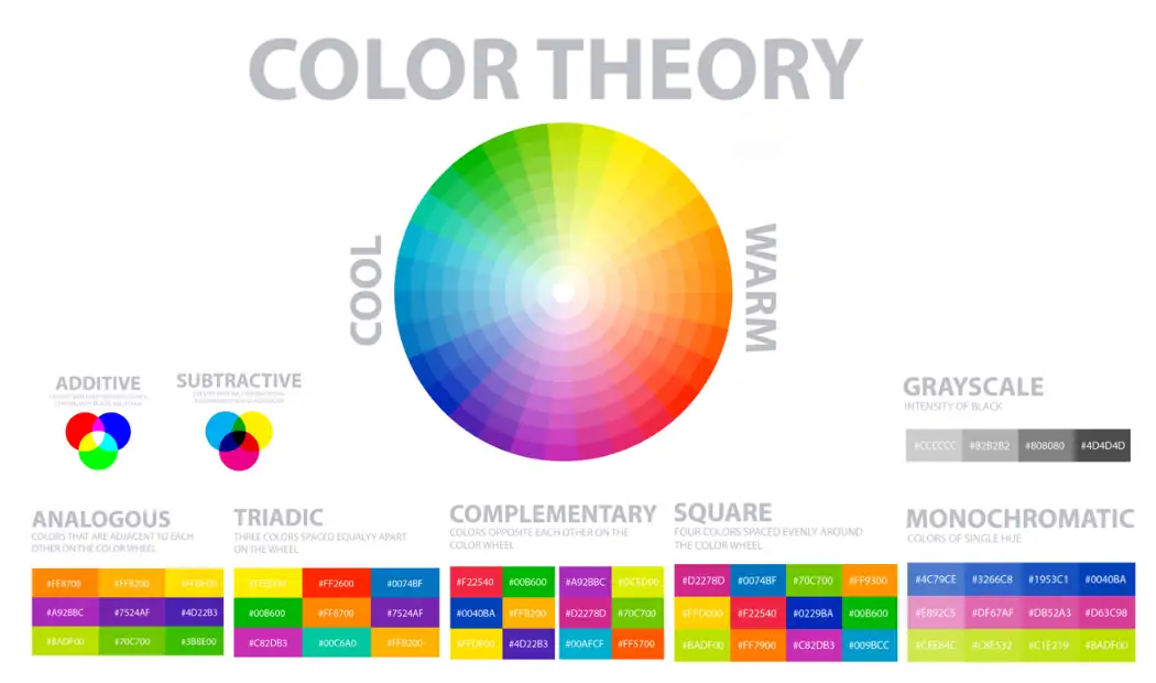
Color theory isn’t scary. Here’s the stuff you need:
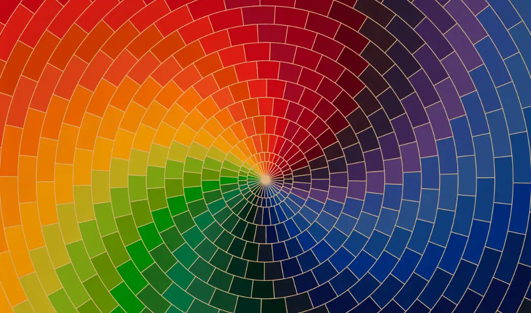
The Color Wheel Breakdown
- Primary Colors: Red, Blue, Yellow
- Secondary Colors: Orange, Green, Purple (mixing two primaries)
- Tertiary Colors: Mix of one primary + one secondary
Core Relationships
| Type of Combo | Example Pair | Mood or Effect |
| Complementary | Blue & Orange | High contrast, vibrant |
| Analogous | Blue, Blue-Green | Peaceful, harmonious |
| Triadic | Red, Yellow, Blue | Balanced, energetic |
| Split-Complementary | Red, Blue-Green | Balanced with a punch |
| Monochromatic | All blues | Minimalist, elegant |
Pro Tips for Abstract Painters

Tips You Didn’t Know You Needed
- Start with 3 colors max. Overloading your palette muddies the message.
- Use white or black to stretch colors. They don’t just lighten or darken—they shift the mood.
- Texture changes color perception. A rough blue can feel colder than a smooth blue.
- Test colors wet and dry. Acrylics shift tone as they dry. Be ready for surprises.
- Use layering. Bold base + transparent top = unexpected results.
Choosing a Color Palette Based on Mood
Mood-Based Palette abstract color wheel is here for you:
| Mood | Color Suggestions | Add Contrast With |
| Tranquil | Soft blues, greens, lavender | A touch of white or silver |
| Energetic | Orange, red, yellow | Deep black or navy accents |
| Mysterious | Indigo, charcoal, dark purple | Metallics or warm creams |
| Romantic | Pinks, peaches, rose gold | Olive green or smoky gray |
| Angry/Raw | Crimson, black, dirty orange | Neon green or turquoise |
Mistakes to Avoid

- Using all bright colors. No contrast, no focus.
- Forgetting neutrals. Grays and browns help colors pop.
- Matching everything. Chaos is part of abstract—let colors clash.
- Copying others blindly. Learn, but create your own style.
- Skipping the testing stage. Swatch before canvas. Always.
Color Combos That Work
Let’s explode your canvas with clarity. This section answers it all: what colors go with what when painting
abstract art—plus, exact combos for every major color you might be working with.
| Base Color | Use With These Colors | Why It Works |
| what color goes with yellow | Purple, Navy Blue, Charcoal Gray | Creates strong contrast with high energy |
| what color goes with blue | Orange, Burnt Sienna, White | Balanced. Feels modern and open |
| what color go with violet | Mint Green, Cream, Bright Pink | Fresh, playful, or mystical depending on ratios |
| what color goes with green | Magenta, Peach, Deep Brown | Adds warmth and electric contrast |
| what color go with red | Teal, White, Olive Green | Striking combos for bold, raw expression |
| what color go with pink | Aqua, Lemon Yellow, Black | Fun, funky, and full of youth |
| what color go with purple | Mustard Yellow, Turquoise, Cool Gray | Feels regal, psychedelic, or retro |
| what colors go with white | Everything – but especially Red, Black, Gold | White lifts, balances, and defines surrounding hues |
| what color go with black | Neon Pink, Emerald Green, Metallic Silver | Creates luxury or total punk impact |
Summing Up!
Abstract painting is personal. But colors are your secret weapon. Don’t guess—plan. Choose your combos based on emotion, purpose, and vibe. Always ask: what colors go with what when painting abstract art? Use bold pairs. Use contrast. Add neutral tones. Test, layer, and explore, even start with abstract art coloring pages.
Your canvas becomes your playground. And remember—your art doesn’t need to “make sense.” It needs to feel. When your colors talk, your audience listens. Now go make something jaw-dropping. Something loud. Something that only you could create. That’s the beauty of abstract. That’s the magic of color.
Looking for the best paint by number kits? Explore Art of Paint by Number.